Sunday, September 3, 2017
Wednesday, August 3, 2011


Tuesday, August 2, 2011


Sunday, July 31, 2011


Wednesday, July 20, 2011


Tuesday, May 24, 2011


Friday, May 6, 2011


Tuesday, April 12, 2011


Wednesday, April 6, 2011


Monday, April 4, 2011

Tuesday, March 29, 2011


Thursday, March 24, 2011


Friday, January 21, 2011
The World of Illustrators: Hablot Knight Browne (Dicken's Illustrator)

I decided to start this blog because there doesn't seem to be any good resources out there that talks about the great men and woman of the world of Illustration. I am an illustrator, and I know how important it is to know your roots, why today we create images, draw lines, colour, the way we do. This blog will be a bit of an exploration for me in the history & lives of many illustrators I am interested in, and will cover both historical legends, and current contemporary heroes.
I decided to start with Hablot Knight Browne, the man who made his name illustrating Dicken's stories. In many ways Illustration itself is linked to books, and Dicken's books were the first books to be really avaliable and accessable to the middle and (of those who could read) lower class, which was appropriate as many of his novels contained themes of social reform and questioning of popular society.
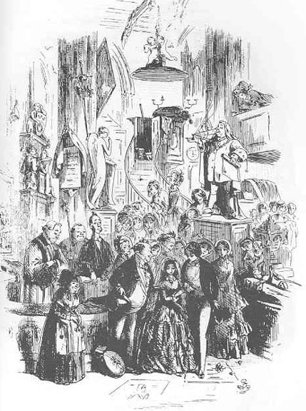
Hablot Browne was born in 1815 (a long time ago). He met Dickens on 1836, at 21 years of age. He had already been working as an artists, and Dicken's was looking for an artist for his novel Pickwick, and after sumbitting his work to the publisher's office, he was given the job. Below is one of the drawings he did for Pickwick (he signed the illustration as Phiz)


Below are some images I have gathered by this great artist. His sense of story telling and focus is very interesting when considered closely, and these pictures show us another world, over 150 years ago, yet filled with people who we can still sympathize with and understand.


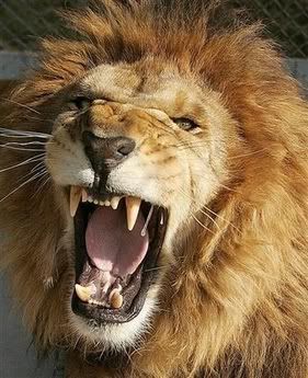
How to draw a Lion's head
This tutorial will take you through the basic steps of putting together a Drawing from reference. We will be drawing a lion's head, with his main etc in this tutorial, but basically you can apply this process to drawing most things from photo reference.
First things first, find good reference! It's always important to use reference when you are drawing, especially if you are drawing something realistic. The human eye can easily spot mistakes in proportion and anatomy, so if you can, always try to find good reference. However, whatever you do don't trace! Instead use a lot of different photos, but loosely, see it you can just take elements, proportions, shapes and textures from the photo, rather that exactly copying the image, eg an ear here, examine the shape of the eyes. I'll run you through this process.
I did a light sketch of the general shapes of the Lion's head. Big, geometric shapes are best. When drawing his mane I was careful NOT to go into detail, but instead to capture the shape of it. I have fallen into the trap of detailing the hair much to early on many times before, it's never helpful. (the picture below has been contrast adjusted so you can see the original lines, but in reality, they weren't so dark.)
 Then I started putting in basic shapes and the form of his face and mane, using a bit of comic-style exaggeration. While drawing keep flicking your eyes to the reference drawing, checking things are in the right place, the right shape and the right size. I erased the original basic shapes (the previous step) as I went along, which wasn't difficult as I had drawn them in very lightly.

Next I began inking the drawing. I used my Zeta Pad (a kind of tracing paper that can hold ink very nicely) to trace over my original drawing, with careful and considered lines. I used a very nice Ink pen I bought at a Japanese shop in Auckland, it works very much like a brush & ink, and was only a couple of dollars. I am going to be very sad when it runs out :3
However you can use a brush and indian ink to achieve the same kind of results. Or just normal felt markers, but make sure you use an ink sensitive paper, like a Zeta pad, or hot-press illustration board. Even mounting board would be fine, anything that can hold ink and not bleed. This image below is straight from the scanner and unadjusted in Photoshop.
 Open your file in Photoshop, and hit CTR+L or Apple+L on a Mac. Adjust the levels so you are essentially left with just black lines, line so:
 After scanning, you usually need to do a little editing in Photoshop. The following things I want to change with this picture, the line that crosses the whole bottom of the mane doesn't look very good:

So I first erase the line on his mane using the eraser tool, like so:
 His tongue needs work as well:
 So I erase the black to exaggerated the form of his tongue inside his mouth.

Complete! This drawing can be coloured in Photoshop or illustrator or left in Black & White, it can be converted to a vector if you like. I will be using this drawings in further tutorials, including an upcoming tutorial on the very best way to select & colour a linework in Photoshop.

First things first, find good reference! It's always important to use reference when you are drawing, especially if you are drawing something realistic. The human eye can easily spot mistakes in proportion and anatomy, so if you can, always try to find good reference. However, whatever you do don't trace! Instead use a lot of different photos, but loosely, see it you can just take elements, proportions, shapes and textures from the photo, rather that exactly copying the image, eg an ear here, examine the shape of the eyes. I'll run you through this process.
I did a light sketch of the general shapes of the Lion's head. Big, geometric shapes are best. When drawing his mane I was careful NOT to go into detail, but instead to capture the shape of it. I have fallen into the trap of detailing the hair much to early on many times before, it's never helpful. (the picture below has been contrast adjusted so you can see the original lines, but in reality, they weren't so dark.)


Next I began inking the drawing. I used my Zeta Pad (a kind of tracing paper that can hold ink very nicely) to trace over my original drawing, with careful and considered lines. I used a very nice Ink pen I bought at a Japanese shop in Auckland, it works very much like a brush & ink, and was only a couple of dollars. I am going to be very sad when it runs out :3
However you can use a brush and indian ink to achieve the same kind of results. Or just normal felt markers, but make sure you use an ink sensitive paper, like a Zeta pad, or hot-press illustration board. Even mounting board would be fine, anything that can hold ink and not bleed. This image below is straight from the scanner and unadjusted in Photoshop.


Complete! This drawing can be coloured in Photoshop or illustrator or left in Black & White, it can be converted to a vector if you like. I will be using this drawings in further tutorials, including an upcoming tutorial on the very best way to select & colour a linework in Photoshop.

Subscribe to:
Comments (Atom)