Friday, January 21, 2011

The World of Illustrators: Hablot Knight Browne (Dicken's Illustrator)

Hablot Knight Browne (Dicken's Illustrator)

I decided to start this blog because there doesn't seem to be any good resources out there that talks about the great men and woman of the world of Illustration. I am an illustrator, and I know how important it is to know your roots, why today we create images, draw lines, colour, the way we do. This blog will be a bit of an exploration for me in the history & lives of many illustrators I am interested in, and will cover both historical legends, and current contemporary heroes.

I decided to start with Hablot Knight Browne, the man who made his name illustrating Dicken's stories. In many ways Illustration itself is linked to books, and Dicken's books were the first books to be really avaliable and accessable to the middle and (of those who could read) lower class, which was appropriate as many of his novels contained themes of social reform and questioning of popular society.

Hablot Browne was born in 1815 (a long time ago). He met Dickens on 1836, at 21 years of age. He had already been working as an artists, and Dicken's was looking for an artist for his novel Pickwick, and after sumbitting his work to the publisher's office, he was given the job. Below is one of the drawings he did for Pickwick (he signed the illustration as Phiz)

Below I have tried to enhance the illustration a little to show the quality of line and form even so young in his career. This loose precision was common in the times Browne was illustrating in, notice the angle of line he used, and the depth of form he was able to achieve. This, in combination with his great sense of character, storytelling and expression, he created great pictures.
Browne and Dickens became good friends and traveled occasionally together. Browne ended up illustrating ten of dicken's books, including David Copper field, of which he is most famous for. His strong sense of story telling made him a perfect illustrator to Dicken's character-driven Novels. Below is the cover pages from A Tale of Two Cities (click on the image to take a closer look). Notice how he lightly details the backgrounds of the group of people under the tree, letting the detail fade out in a circular form. There is a sense of drama in the piece, as the young man with messy hair stands in shadow with a flower in his hand. The young faces are elegant and oval, with sweet (tragic) features. The sense and theme of the novel is apparent without reading the first paragraph of the novel.
As well as illustrating for Dickens, Brown drew plates for more than twenty of Charles Lever's novels, and was also famous for illustrating books by William Ainsworth. Browne illustrated until 1867, when he suffered from an illness (a stroke) which temporarily paralyzed him. He recovered and went back to work, but his health gradually worsened. He died in 1882.

Below are some images I have gathered by this great artist. His sense of story telling and focus is very interesting when considered closely, and these pictures show us another world, over 150 years ago, yet filled with people who we can still sympathize with and understand.

How to draw a Lion's head

This tutorial will take you through the basic steps of putting together a Drawing from reference. We will be drawing a lion's head, with his main etc in this tutorial, but basically you can apply this process to drawing most things from photo reference.

First things first, find good reference! It's always important to use reference when you are drawing, especially if you are drawing something realistic. The human eye can easily spot mistakes in proportion and anatomy, so if you can, always try to find good reference. However, whatever you do don't trace! Instead use a lot of different photos, but loosely, see it you can just take elements, proportions, shapes and textures from the photo, rather that exactly copying the image, eg an ear here, examine the shape of the eyes. I'll run you through this process.


I did a light sketch of the general shapes of the Lion's head. Big, geometric shapes are best. When drawing his mane I was careful NOT to go into detail, but instead to capture the shape of it. I have fallen into the trap of detailing the hair much to early on many times before, it's never helpful. (the picture below has been contrast adjusted so you can see the original lines, but in reality, they weren't so dark.)

Then I started putting in basic shapes and the form of his face and mane, using a bit of comic-style exaggeration. While drawing keep flicking your eyes to the reference drawing, checking things are in the right place, the right shape and the right size. I  erased the original basic shapes (the previous step) as I went along, which wasn't difficult as I had drawn them in very lightly.


Next I began inking the drawing. I used my Zeta Pad (a kind of tracing paper that can hold ink very nicely) to trace over my original drawing, with careful and considered lines. I used a very nice Ink pen I bought at a Japanese shop in Auckland, it works  very much like a brush & ink, and was only a couple of dollars. I am going to be very sad when it runs out :3 
However you can use a brush and indian ink to achieve the same kind of results. Or just normal felt markers, but make sure you use an ink sensitive paper, like a Zeta pad, or hot-press illustration board. Even mounting board would be fine, anything that can hold ink and not bleed. This image below is straight from the scanner and unadjusted in Photoshop.

Open your file in Photoshop, and hit CTR+L or Apple+L on a Mac. Adjust the levels so you are essentially left with just black lines, line so:
After scanning, you usually need to do a little editing in Photoshop. The following things I want to change with this picture, the line that crosses the whole bottom of the mane doesn't look very good:

So I first erase the line on his mane using the eraser tool, like so:

His tongue needs work as well:

 So I erase the black to exaggerated the form of his tongue inside his mouth.


Complete! This drawing can be coloured in Photoshop or illustrator or left in Black & White, it can be converted to a vector if you  like. I will be using this drawings in further tutorials, including an upcoming tutorial on the very best way to select & colour a linework in Photoshop.

Wednesday, January 19, 2011

Illustrator - How to import scanned linework into Adobe Illustrator and do a Live Trace.

This tutorial is the first of a series of Adobe Illustrator tutorials I will be creating that will teach you the basics of importing scanned line into Illustrator and producing a nice vector image.

(For this tutorial you will need  Adobe Illustrator (CS2 or above), Adobe Photoshop, and some paper and a nice black pen.)

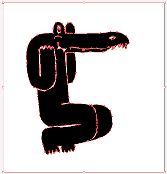
Firstly, when you are drawing your design, cartoon, illustration, keep in mind how you will be importing it into Illustrator. I will be showing you how to create image made of one solid vector colour, so don't create an image with rendering or form, unless it is a solid black colour. Create something like this:
Obviously we all draw, design and create different images, but the key thing to remember here is solid shapes. This image is simple, and will transfer nicely to a vector graphic.


So, once you have drawn up your image, scan it into your computer, grayscale, at at least 300 DPI (dots per inch).  This is a nice resolution to scan in as a general rule, it is the normal resolution for at which Print Companies print at. Then open up Photoshop (I use CS2, but the version isn't important for this tutorial) and open your drawing.

Use the crop tool to crop your drawing down so you just see the drawing and the surrounding white paper as shown below:


Then go and adjust the levels to give the image more contrast. The levels is located in the photoshop menu Image>Adjustments>Levels or you can just CRL+L in windows or Apple+L on a Mac. Adjust the levels like so:

Bring the left handle to the middle of the big mountain on the left (this will make your black ink drawing more completely black). Then bring the right handle past the right mountain toward the middle valley This will eradicate most small pencil lines, paper texture and mistakes, cleaning things up a bit. Click OK.
Save this file as a PSD, JPG or TIFF if you like and you can close photoshop.
Great, now we are ready to import your file into Illustrator!

Open Illustrator and File>Open your edited scan. It should open up looking much the same as it did in photoshop:
Now select the cursor tool (the black arrow, 'v' on you keyboard), and click on you imported image.

Next go up to the menu Object>Livetrace>Tracing options. A box like this will open with default settings:
I will leave it to you to fiddle around with the options later, but there are already some good settings in your illustrator Presets (such as Inked Drawing or Comic Art) that usually work very well. However I have a custom setting I like to use, so put in these details below:
Then hit Trace. Your computer will work a little while producing the vector art, depending on how complicated your image is. You should have a result something like this:

This is a great start , and you can go ahead and edit any thinks you don't like about the vector later.We are almost finished but first you need to expand the Live trace. make sure you still have the vector selected and go up to Object>Live Trace>Expand. Your image will now look like this:
You have here the white of the paper, and the different objects that make up your drawing (in this case the eye, the arm, the leg). Now, because if you try to move the vector around you will find they are grouped, you need to ungroup the selection. Object>Ungroup or right-click the image>ungroup. 

Great. Now click outside the panel area to unselect the vector paths, and then click again on the WHITE BACKGROUND. It should look like this:
Once you have this white area selected we want to grab all the other white areas in the vector, so go up to Select>Same>Fill Colour. This will select all the other white vectors Live Trace has created. Hit the Delete button. Now we don't have any white areas left in the file.

Now press CTR+A or (Apple+A on a Mac) to select all the objects and then CTR+G or Apple+G, to group you vector.

Nice! You now have a Vector image you can put on top of any background and you can change it into any colour you wish (using the the colour slider or swatches).
From here you can edit your vector handles and correct any paths you don't like.


I used this technique to create the following Design. Enjoy! Please do leave a comment if you have any questions or anything to mention I may have missed out.


Friday, January 14, 2011

More Skreened shirts,

In my sore on Skreened 'Hello T-shirts' http://skreened.com/helloshirts/ I have created 4  more new tshirts. I have given up trying to impress the humour-biases masses on Threadless and the like (although I really do like the french T-shirt site lafraise.com) and have started down the hard road of PODs (printed on order websites) where you make a small commision everytime you make a sale on the POD website.

I like Skreened (I really don't like Zazzle and Cafepress) and have started my first shop there. There is some great quality stuff on Skreened, but its still in the margin of about 10% cool, 90% relatively boring to look at. Still it's a start.
Anyhow, here are the 4 new T-shirt designs I've created. Let me know what you think.


Thursday, January 13, 2011

Skreened

I have just started an account on Skreened, a Tshirt collective, 
where they print your T's and give you (the designer) a commission.
 
 
Check out my first submission 
And buy it if you like it, its selling at a very reasonable price.

Wednesday, January 12, 2011

Amazing photos of Vietnam

Im totally in love and in awe of these amazing photos of Vietnam by David Terraza


His work reminds me of Philip Jones Griffiths
who is an old favourite photographer of mine. His war photography made me look at the world in a completely new way. 

However Terraza's work also reminds me why I am not a photographer today - firstly I do not enjoy the technical side of photography very much. Secondly any Jo can pick up an expensive camera (and anyone can buy an expensive camera these days) and take stunning photos with little or no thought of compsition, framing, cropping etc. And go on to win competitions and awards. It felt to me, after a year or so of considering photography as a career, that those who do well in photography are technitians rather than creative people. 

However, Terraza's work, while technical, is subtle and beautiful. Photos like these can change your life.

On another note, I am thinking of redesigning my website (again) to putting it up on either http://cargocollective.com/ (which costs a little bit of money) or http://www.exhibit-e.com/ (which is essentially free, but not so fancy and a bit more work)


Monday, January 3, 2011

You can now download my portfolio from my website!

Yes it's true, it's what you all have been waiting for! At last, the sun has risen, light has flooded your computer screens and you can download a PDF copy of my Illustration porfolio (or design if you like, but that is mostly for the small amount of freelance graphic design clients I get).

Just Jump on the Index page of my website Simonjfletcher.com/index and you will see the link. Also you will noticed I have made my website slightly more easier to use, by placing my most current projects in a feed on the index page. I will add more sections as my portfolio increases. In fact I am going to upload at least 2 more projects in the next month, one displaying the work I have done for an advertising company here in Sao Paulo in the past month and a half, the other another personal project of mine. Also I might put up some work I have been doing on a graphic novel concept, but Inking it is getting me down. Inking a comic page is time consuming to say the least!

Or, to make things easier, download my portfolio from this (very very popular) blog:


Sunday, January 2, 2011

Brad Holland

Have you every heard of Brad Holland?
If not, please find out about him. He is one of the most important illustrators in the history of modern illustration thus far, and he recently made a fantastic post about the New York Time's Op-Ed section, and his involvement in it. He tells his inspiring story of how he made his way through illustration, and the article is accompanied by his fantastic illustrations.

 The article is on Drawger :

http://www.drawger.com/holland/?article_id=11374#comments

Some of his work: